Image Sizing Setting
Improving image editing capabilities
Company
Shopify
Role
Sr. Product Designer
Project Date
2022-2023

About the project
In addition to designing themes at Shopify, I also worked on projects to increase the flexibility of the theme features and theme editor settings to decrease the number of manual code edits performed by merchants. This project was a very complex yet one of the most impactful projects I’ve worked on during my time at Shopify.
Problem 1: Setting defaults
The image sizing setting defaults were not optimized for successful outcomes. For example, the slideshow section being defaulted to the first image’s height made it challenging for the merchants to find the best image height that would avoid having a very tall slideshow like this.

Slideshow section: Hero image pushing the remaining sections below
Problem 2: Setting labels
Same sizing settings were being referred to by different labels and help texts were confusing for the merchants.

Height and size settings labels across different theme sections
Problem 3: Images expanding the viewport
Images expanding past the viewport was especially problematic
for product detail pages where image presentation directly impacted merchant conversions.
This page having had the highest number of support tickets and code edits led us to prioritize it over other pages.
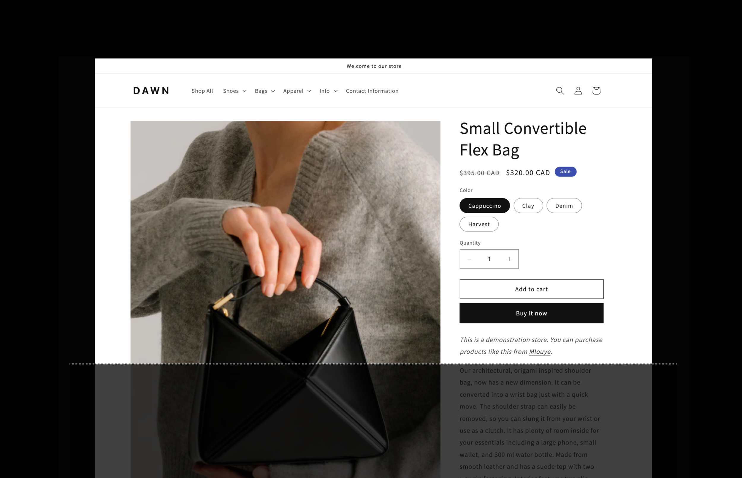
Product detail page: A tall image expanding viewport

Common Aspect Ratios
I conducted a deep dive to the data to explore new image settings for product detail page. Findings represented that 60% of the merchants used 1:1 image ratio, followed by 2:3 and 3:4.
Exploration 1: Aspect ratio setting
I introduced an aspect ratio setting and set the default to 1 by 1.
However, this didn’t quite work out for the tall images. A focal point feature would have been the ideal solution, however due to the high level of dev effort, it wasn’t an option at this time.


Object fit setting
To avoid improper croppings like above, I added an object fit setting in addition to the aspect ratio setting, but it increased the white space around the image.


Desktop media width setting
To solve for the white space issue, I added more granularity to an existing setting named “desktop media size” which was controlling the image column width.


Exploration 2 : Aspect ratio setting
As an alternative solution, I decided to respect the original ratio of the merchant image to avoid improper croppings by default.
Fixed viewport height setting
To have the image automatically fit within the viewport without the merchants needing to figure out the best setting combination, I explored a “fixed viewport height” setting. This was a safe solution with minimal change, however this setting didn’t work well with the aspect ratio setting.
The issue with this was the number of changes. Every time we rolled out updates, it had an impact on the merchant online store defaults of and the theme demo stores, posing a potential risk.
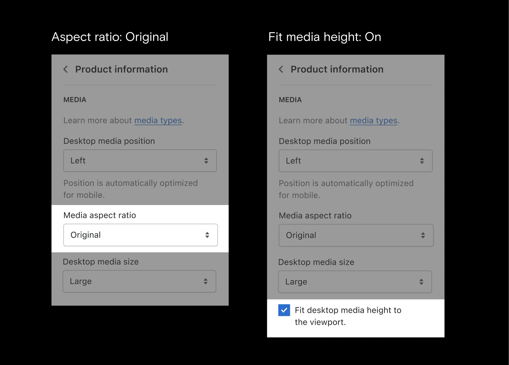
Solution
Removing the aspect ratio setting, keeping the “object fit” setting along with the “fit media to screen height” checkbox and changing the “media width” default from large to medium guaranteed a high impact solution with a minimal change to the merchant stores.

Learnings & Impact
Covering all the edge cases during the exploration phase was challenging. Building a live prototype with my developer partner helped us identify the limitations quickly and reduced the time spent during the alignment and quality assurance phases.
Increased flexibility on the image sizing settings reduced the number of support tickets and streamlining the content directly impacted user trust.